October is here! Time for crisp fall mornings, changing leaves, and warm drinks. We can’t imagine a better place to experience these specific seasonal joys than in this month’s project spotlight.
This home is very close to our hearts because it belongs to our very own Brook Gardner and his family. After renovating their home many years ago, they decided it was time for a kitchen update, and the results are, well, absolutely marble-ous.
Before:

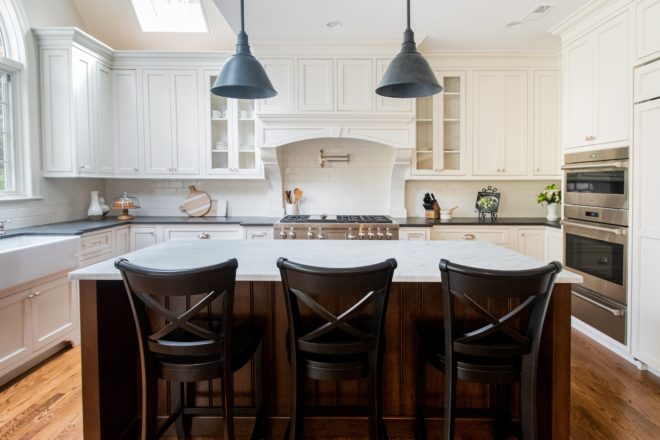
While the space was lovely and fit their home’s farmhouse motif, these homeowners were ready for an update. They loved their kitchen’s layout, so instead of opting for a full renovation, they embarked on a facelift. We can’t say we blame them, because honestly, why mess with perfection? While the cabinetry, island, and other features stayed in place, the goal was to refresh the space by updating the finishes and appliances.

The first thing on the update list was their cabinetry’s color. The red oak was lovely, but to achieve the goal of a sleek, modern space, it had to go. In addition to the color, our homeowners had big plans for a seldom-used desk space in the kitchen. As you will see, after the renovation, the area took on a much more fulfilling purpose.
Next up, the wall behind the kitchen range. While we adore the personalized backsplash, this dated trendsetter was ready for a change-up. The open metro shelving and antique spice cabinet were undoubtedly practical features but were also dated and created visual clutter.
In addition to the major elements, the kitchen’s light fixtures and flooring were also due for updates.
After:
For a facelift, this kitchen looks brand-spanking new! Let’s take a walk through all of the new features and updates in this sleek space.
The most significant change, visually, is the cabinetry. As we mentioned, these homeowners loved their cabinetry’s design, storage, and layout, so instead of installing new cabinets, they decided to paint. When it comes to refreshing a space, painting is a great choice. With that said, we do highly recommend hiring a professional for kitchen cabinetry painting. While rewarding, painting kitchen cabinets is a significant project that demands skill and patience.

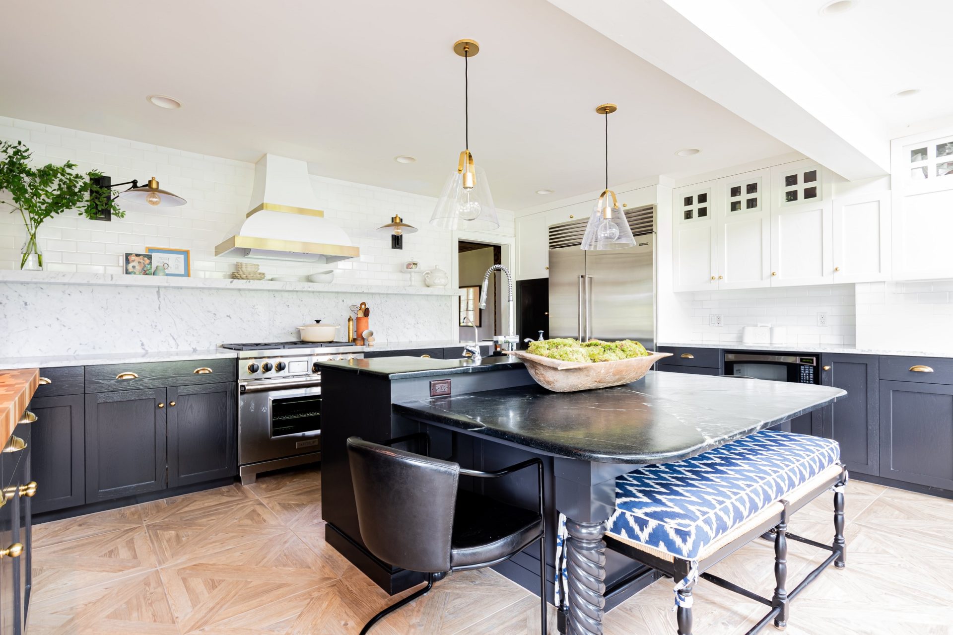
The homeowners decided on a monochromatic two-tone look for their updated space. The white upper cabinetry helps the room feel brighter and more open, while the black lowers bring that sleek, chic appeal. Since this project was just a refresh, deciding to reuse the original marble and soapstone countertops was a no brainer! They work perfectly with the new colors, not to mention that they are in gorgeous shape. Take notes: white marble and soapstone never go out of style!
We mentioned the seldom-used desk area before, and that the Gardners knew there was a better use for that space. With a barn full of animals on their farm, it shouldn’t surprise anyone that the Gardners would want to carve out a nook in their kitchen for their pets. And of course, Glenbrook Cabinetry left their mark by designing this luxurious little home!
Nothing but the best for these pups! The beautifully integrated new cabinet has brass screened doors, which coordinate with the space’s new hardware. And when the doors are closed, you would never know this new pup cubby was any different from the rest of the cabinets (aside from the glam doors, of course). In the eat-in/perfect-spot-to-drink-morning-coffee area of the kitchen, not much has changed. As we said, there is no need to mess with perfection, and we think this cozy spot comes pretty darn close. The homeowners also chose to paint their built-in bookcase to match their new cabinetry colors and update the flooring. Nothing too dramatic, but just enough to ensure the room’s overall cohesion. Now, please excuse us while we curl up with a good book and soak up all of this gorgeous natural light!

Just kidding; we have more exciting features to show you!
At the heart of the kitchen, you’ll find the Gardner’s unique island. We rarely see multi-height islands, especially with a table built-in, but this piece is so perfectly functional for this space, we had to show it off. The table-height section of the island allows its chairs and bench to do double duty when pulled over to join the adjacent seating area around the room’s gas fireplace.
As we said before, the island’s original soapstone countertops were in great shape and worked perfectly with the new finishes in the space. One thing that we wanted to highlight is the island’s sink. Made also from soapstone, it gives the island a luxuriously seamless appearance, while also maintaining a unique farmhouse charm.

Above the island, you’ll find a few more new additions. The original kitchen pendants were replaced with the Karin pendant by Mitzi. Simple yet elegant, the aged brass hardware works to tie the lighting in the with the other accent hardware in the space, while the Edison blubs and clear glass shades give a hint to modern design. The light fixtures are visually spare and transparent, contributing to the room’s open and uncluttered design.

Next up, the range area! We’ve seen (and completed) our fair share of custom projects before, but this kitchen shelf, backsplash, and the upper wall were a first.

This 14-foot long floating marble shelf was a feat of engineering and required a highly coordinated effort from the construction team. After designing and purchasing the piece from Stone Tech Marble, we brought in a structural carpenter to install 10 floating brackets, each secured to the studs behind the wall. The brackets are designed to be completely hidden from view, and securely support the stone shelf which weighed more than 200 lbs. Once the carpenter gave the all-clear for installation, an electrician prepared for flush led lighting to be installed in a linear recess on the underside of the shelf. After the wiring was complete, the shelf itself was mounted into the invisible brackets with a lot of muscle. After the shelf was in place, a marble slab backsplash was installed underneath, subway tile was completed above to the ceiling, and voila! This kitchen now has a sleek, modern, and functional backsplash and wall. Not only is it unique, but it gives the space a luxuriously minimalistic look.

We could go on, waxing poetic about that shelf and backsplash, but there are so many other eye-catching pieces to enjoy. For example, the stunning custom range hood! This statement piece works in more ways than one. Of course, it’s functional, but aesthetically, it’s the perfect fit for this kitchen. The brass accents and a polished finish give this hood a modern look, but the curves and rustic shape appeal to the kitchen’s farmhouse motif. Modern + Farmhouse = an excellent choice all around for this kitchen’s focal point.

Next up (literally) are the kitchen’s new Nox wall sconces from Arteriors. A touch of sleek and industrial, these lights, again, play double duty in this space, blending modern design with farmhouse charm. We have to admit, while the room definitely had character before, we think these are quite the improvement!

Down at the counter level, the next new feature is the Wolf range. Wolf brand ranges typically come with red knobs and silver handles, but this is not your typical kitchen. Custom black knobs with brass bezels were installed on this range to assure coordination, down to the smallest detail.
The final highlight of this kitchen, or should we say low light, is the stunning ceramic flooring in a parquet design. Subtle enough not to distract from the other features in the kitchen and full of classic charm, the faux parquet wood design is very modern with its large scale 24-inch square tiles. Faux wood ceramic tile is always an excellent choice for kitchens; it gives you all of the warmth and texture of traditional flooring with the added durability of ceramic.

And that is how you do a kitchen facelift, folks! Again, we certainly want to give a shout out to the individuals at Stone Tech Marble for their fantastic work engineering that shelf! Click on over to Houzz to see even more images


Comments are closed.