This month’s project spotlight is a fresh take on transitional design. We met our client’s the first time (virtually), as they were relocating to the North East from the great state of Texas. When they decided to purchase their home, they knew that it would need a few alterations.
You see, our homeowner’s professions require them to move fairly often, and creating a space with an elevated sense of style and functionality would not only improve their new home but help it sell quickly down the road if need be.
Before:
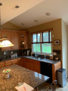
The first space that needed TLC was the builders-grade kitchen.
The dated cabinetry, small island, and dark backsplash made the space feel small, dark and dated. Although it was open to the adjacent living space, it still felt segmented by a staircase in the center home. Next to the kitchen sat a small laundry room, which doubled as an informal entry.
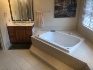
On the second floor, the master suite lacked both space and style. First, the master suite’s closet was a bit smaller than the homeowners were accustomed to. They wanted to expand the closet for extra storage and to create more space for the master bath. Speaking of the master bath, it had a similar look to the kitchen. With a large built-in tub surround and builder’s grade finishes, the entire space left much to be desired.
After:
Before we dive into the absolutely gorgeous results, let’s talk about layout changes. To create a larger and more open kitchen, we wanted the design to focus on moving things around inside the home instead of changing the structural footprint. Because the kitchen was in the back corner of the house, it left us with one opportunity to create more space: taking over the laundry room entry. It offered the kitchen more space and natural light by incorporating an exterior door to the room’s dark corner.
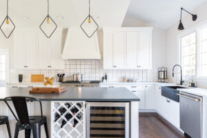
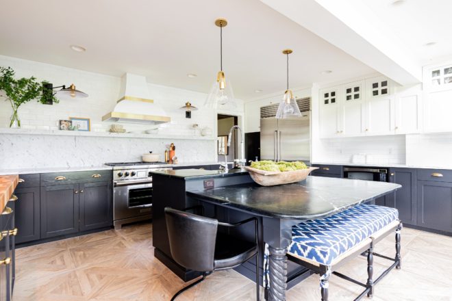
The result, this deliciously modern kitchen with plenty of space to gather, storage for necessities, visual continuity, and easy access to each of the adjoining rooms.
We started by working with Glenbrook Cabinetry to design the kitchen’s layout and cabinetry. The homeowners wanted to create something versatile that would appeal to anyone’s taste if they ever needed to move again without compromising their modern style. What is more versatile or modern than black and white? Not much!
The perimeter, island, and upper cabinetry were all finished in Glenbrook’s signature Snowcap color, which creates a nice, cohesive look throughout the kitchen. To help the room feel larger (and create more storage), Glenbrook designed the upper cabinetry to ceiling height (which also eliminated the gap left by the previous cabinetry to hoard dust). Glenbrook Cabinetry also designed a clean, modern range hood cover and a pantry alongside the refrigerator to complete the look.
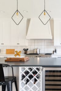
To create a more neat, neutral appeal, the homeowners chose to top the perimeter cabinetry with Emerstone quartz in Monet. The stone is non-porous, so it’s easy to clean and maintain, making it the perfect choice for our homeowners and their small children. To add a bit of contrast and texture, they opted to top the island with Charcoal Soapstone from Silestone in a suede finish.
Let’s talk more about this island! Nine and a half feet of space offers plenty of room for activities, meal prep, and more; Glenbrook did some beautiful work here. The island also has its own drink refrigerator, custom wine rack, and microwave space, which adds to the overall functionality and alleviates counter-top clutter.
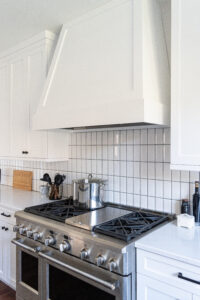
As we said before, as versatile as the kitchen is, our homeowners wanted to add a few modern flair touches. They opted for subtle details, but we can certainly get behind that—the first feature: the backsplash. Everyone loves a good subway tile, but our homeowners chose a beveled tile to ramp things up and chose to flip it vertically. Subtle, but a detail that can’t be overlooked when talking about the modern elements in the space.
Our next favorite feature: the island pendants. Our homeowner actually found these, and what a find they were! The minimalist design of these Dainolite matte black and vintage bronze over island pendants adds just a touch of modern flair without totally overwhelming the space. Plus, light fixtures are fairly easy to swap out, should the need arise, and any new homeowners want to make a change.
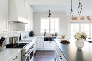
We just wanted to point out one last thing because we love it so much: the black Franke farmhouse sink. It’s a small detail, but when so many opt for white ceramic, it’s a refreshing change (and, pro tip: it makes sense because black hides all of those little water drops and specks that stand out on lighter colors).
Onto the second floor. First stop: the new laundry room!
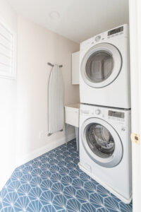
Relocated from the first floor, this laundry room used to be part of the master bath, but it’s a dainty little space all its own after the renovation. Not only did this move make more room for the kitchen, but it makes life easier! The clothes go to the bedrooms, which are on the second floor, with fewer steps! The homeowners chose to have some fun by using blue hexagon striped tile as the flooring.
In the master suite, we moved a few things around to create a second walk-in closet for our homeowners, which would be an additional selling point, should the need arise. But the real star of the second floor renovation is the master bathroom!
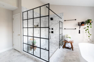
Say farewell to the space-consuming built-in tub and builder’s grade storage, and hello to the airy transitional style of this beautiful new master bath. The first step in updating this space was creating a straightforward layout. We removed the existing shower, soaking tub, and two separate vanities on opposite ends of the space.
As with the kitchen, we worked with our homeowner to create a versatile master bath with a few modern touches. One of the first modern statement pieces you notice as you step into the room is the Metropolis glass shower surround by Glasscrafters. The warehouse-style design has a chic industrial feel that elevates the room’s overall style. The black trim of the panels, the bath’s black hardware, and vanity create depth and much-needed contrast.
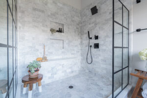
Speaking of lighter elements, let’s talk about the gorgeous shower tile and bench! Meram Polished Carrara from The Tile Shop not only gives the shower a classic look, but it brings a certain softness with its warm pink undertones. The homeowners opted for the same stone in a hexagon design for the floor tile to bring in a hint of modern appeal. The shower also includes two niches for storage and a perfect bench seat topped with Artic White polished Quartz.
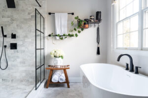
Now, what would a relaxing suite retreat be without a soaking tub? Instead of a massive built-in, these homeowners opted for a modern, free-standing soaking tub. Complete with black hardware to match the bathroom’s details, it’s an inviting feature that begs to be enjoyed.
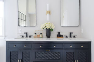
Last but certainly not least, we have the master bath’s new double vanity set-up! Our clients made a fantastic choice with this glossy piece. Topped with Artic White quartz paired with the modern black framed mirrors and aged bronze bath bar sconce, it’s a modern space with glamorous style.
We’re so glad to have helped our homeowners create a space all their own! Here’s hoping they’ll be able to enjoy it for quite a while. To see more images of this project, check us out on Houzz.



Comments are closed.